Project story · Charlotte, NC
RTS brings its identity to the teaching studio
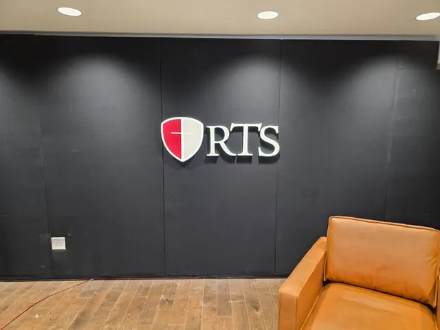
For an online class, the teaching space is part of the introduction. Reformed Theological Seminary wanted its shield and RTS lettering in the background, connecting the instructor’s setting to the institution behind the lesson.
The purpose
More than a wall behind the instructor
When students attend class on campus, they know they’re at RTS. For online students, a sign behind the instructor helps make that connection. For Reformed Theological Seminary’s Charlotte studio, the goal was to bring the seminary’s identity into the background of its online teaching classes.
A sign in that setting has several useful jobs. It identifies the institution behind the instructor. It gives a teaching space a consistent visual anchor as the speaker or subject changes. And it creates an opportunity for students to become more familiar with the seminary’s mark through the lessons themselves.
The backdrop also needs restraint. RTS’s brief called for a clean studio aesthetic with minimal distractions. A shield and three letters offer a compact way to identify the seminary without filling the teaching wall with extra messages.
RTS supplied its logo. Charlotte Sign Studio fabricated and installed the shield and lettering on site, translating that existing identity into a physical feature of the studio.
The finished detail
Depth, contrast and a recognizable mark
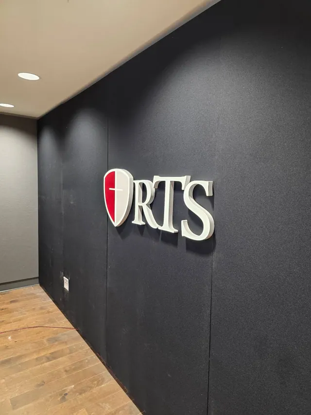
The red-and-white shield anchors the composition. Beside it, white serif letters stand out against the dark wall. Viewed from an angle, the raised edges give the identity a physical presence that a flat graphic would not have.
The sign uses front-lit channel letters with white sides and a 3-inch depth. The finished arrangement keeps the message simple: the shield and RTS lettering, with open wall around them.
That balance matters for a teaching backdrop: enough identity to establish whose space it is, with enough visual quiet to leave the lesson at the center. Here, the dimensional shield and lettering make the wall distinctly RTS without adding a slogan, service list or competing message.